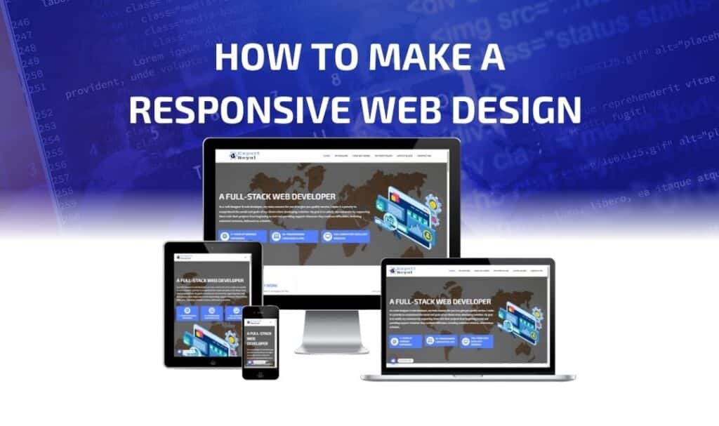
How to Make a Responsive Web Design
In today’s digital world, people use a variety of devices to browse the internet—smartphones, tablets, laptops, desktops, and even smart TVs. A website that looks great on one device might not display properly on another. This is where responsive web design (RWD) comes in.
Responsive web design ensures that a website adapts seamlessly to different screen sizes and resolutions, providing a better user experience across all devices. In this detailed guide, we’ll cover everything you need to know about creating a fully responsive website.
1. What is Responsive Web Design?
Responsive Web Design (RWD) is a web development approach that makes web pages adjust automatically to different screen sizes and devices. Instead of creating multiple versions of a website, one flexible design adapts to all screen resolutions.
✅ Key Features of Responsive Design:
✔ Fluid Grids – The layout automatically resizes based on screen size.
✔ Flexible Images – Images scale without distortion.
✔ Media Queries – CSS rules that adapt to different screen sizes.
✔ Viewport Meta Tag – Controls how the website is displayed on mobile devices.
Example: If you open a responsive website on a desktop, it might display a three-column layout, but on a smartphone, it rearranges to a single-column view for better readability.
2. Why is Responsive Design Important?
✔ Better User Experience (UX): Users can browse the website comfortably on any device.
✔ SEO Benefits: Google ranks mobile-friendly websites higher in search results.
✔ Faster Load Times: Optimized design reduces unnecessary elements for smaller screens.
✔ Cost-Effective: No need to create separate websites for mobile and desktop.
✔ Higher Conversion Rates: A smooth experience across devices increases sales and engagement.
According to Google, over 60% of internet traffic comes from mobile devices, making responsive design essential for any modern website.
3. Key Techniques for Responsive Web Design
There are several core techniques for making a website responsive:
1. Use the Viewport Meta Tag
The viewport meta tag ensures that the website scales properly on different devices.
📌 Add this inside the <head> tag of your HTML:
<meta name="viewport" content="width=device-width, initial-scale=1">
This tells the browser to adjust the website’s width to match the screen size.
2. Implement a Fluid Grid System
A fluid grid allows elements to resize proportionally instead of using fixed widths.
📌 Instead of this fixed width:
.container {
    width: 1200px;
}
📌 Use a percentage-based approach:
.container {
    width: 80%;
}
This ensures the container adjusts dynamically based on the screen size.
3. Use Flexible Images and Media
Images should scale without breaking the layout.
📌 Make images responsive in CSS:
img {
    max-width: 100%;
    height: auto;
}
This prevents images from overflowing their container.
4. Use CSS Media Queries
Media queries allow different styles to be applied based on screen width.
📌 Example: Changing styles for devices smaller than 768px (tablets & phones).
@media (max-width: 768px) {
    .container {
        width: 100%;
    }
    .menu {
        display: block;
        text-align: center;
    }
}
This ensures that the layout adapts to smaller screens by modifying styles accordingly.
5. Mobile-First Design Approach
A mobile-first approach means designing for smaller screens first and then expanding for larger screens.
📌 Example: Start with a mobile-friendly style, then add styles for larger screens
.container {
    width: 100%; /* Default for mobile */
}

@media (min-width: 768px) {
    .container {
        width: 80%; /* Adjust for tablets */
    }
}

@media (min-width: 1200px) {
    .container {
        width: 60%; /* Adjust for desktops */
    }
}
This approach ensures a better experience on mobile devices.
4. Responsive Navigation Menus
Menus need to be easy to use on all devices.
1. Use a Hamburger Menu for Mobile
A hamburger menu hides the navigation links and only shows them when clicked.
📌 HTML:
<button class="menu-toggle">☰</button>
<nav class="nav-menu">
    <a href="#">Home</a>
    <a href="#">About</a>
    <a href="#">Services</a>
    <a href="#">Contact</a>
</nav>
📌 CSS:
.nav-menu {
    display: none;
    flex-direction: column;
}

.menu-toggle {
    display: block;
    background: none;
    border: none;
    font-size: 24px;
}

@media (min-width: 768px) {
    .nav-menu {
        display: flex;
        flex-direction: row;
    }
}
📌 JavaScript (for the toggling menu on mobile):
document.querySelector(".menu-toggle").addEventListener("click", function() {
    document.querySelector(".nav-menu").classList.toggle("show");
});
This allows the menu to toggle open and close on smaller screens.
5. Responsive Typography
The text should be readable on all screen sizes.
📌 Use relative font sizes:
body {
    font-size: 1rem; /* Default for mobile */
}

@media (min-width: 768px) {
    body {
        font-size: 1.2rem; /* Adjust for tablets */
    }
}

@media (min-width: 1200px) {
    body {
        font-size: 1.5rem; /* Adjust for desktops */
    }
}
Using rem units ensure that the text scales properly across devices.
6. Responsive Forms
Forms should be easy to use on mobile devices.
📌 Make input fields full-width on small screens:
input, textarea {
    width: 100%;
    padding: 10px;
    font-size: 1rem;
}
This improves the mobile user experience.
7. Test Your Responsive Design
After implementing responsive design techniques, test your website on different devices.
📌 Best Tools for Testing Responsive Design:
✔ Google Mobile-Friendly Test (https://search.google.com/test/mobile-friendly)
✔ Responsinator (https://www.responsinator.com)
✔ Chrome Developer Tools (Right-click → Inspect → Toggle Device Toolbar)
8. Common Mistakes to Avoid in Responsive Design
❌ Fixed-width layouts – Avoid using px widths; use percentages instead.
❌ Large images – Compress images to improve load time.
❌ Too many breakpoints – Only use necessary media queries.
❌ Ignoring touch-friendly elements – Make buttons and links easy to tap.
Final Thoughts
Responsive web design is essential for a successful modern website. By following these best practices, you can create a website that looks amazing on any device.
✅ Summary of Key Steps:
✔ Use the viewport meta tag
✔ Implement a fluid grid system
✔ Make images flexible
✔ Use CSS media queries
✔ Design mobile-first
✔ Create responsive navigation
✔ Optimize typography and forms
✔ Test on multiple devices
Would you like help with coding a responsive website? Let me know! 😊